What kind of lighting should I choose for the kitchen ?
Kitchen lighting is never just a minor detail. As the heart of your home, your kitchen is where you prepare meals in the morning, enjoy

In 2026, color no longer serves a purely decorative purpose. It becomes a first source of inspiration, an essential foundation, a way to connect with time. It opens the door to another world, like a silhouette or a form, reflecting a deep aspiration for lightness, authenticity, and well-being.
Color tells a story, creates a calming atmosphere, and reflects a search for balance between nature, comfort, and elegance — three key values shaping contemporary interiors.
Decor colors for 2026 move away from short-lived trends to embrace enveloping, deep, and natural tones designed to last. Vintage blue, aquatic green, warm beige, chocolate brown, and terracotta transform interiors into a contemporary retreat, both elegant and comforting.
In this article, discover:
Sommaire
ToggleIn 2026, decorative colors reflect a clear desire to soothe, envelop, and reconnect. Palettes become deeper, more natural, yet more expressive. They create interiors that feel elegant, warm, and meaningful, where each shade contributes to the overall balance of the space.
Trends revolve around immersive colors, supported by strong references such as the Pantone Color of the Year 2026, designed to enhance sustainable interiors and respond beautifully to light.
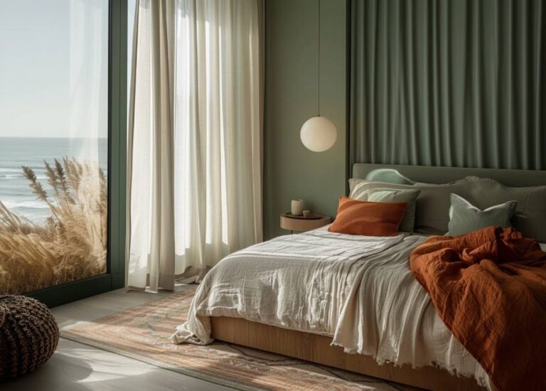
Transformative Teal emerges as the emblematic color of 2026 according to international trend agencies. Positioned between deep blue and aquatic green, this shade represents the meeting point between nature, technology, and well-being.
Sophisticated and calming, it creates an immersive atmosphere ideal for contemporary interiors. Paired with natural materials and soft lighting, it reveals its full depth and turns spaces into true cocoons.
Deep blues continue to play a central role in 2026 interior trends. Echoing Art Deco heritage, they embody a sense of timeless elegance and structure.
Vintage blue, navy, and ink blue work beautifully in living rooms and bedrooms, creating refined and intimate atmospheres. These tones pair especially well with Pantone-recommended light shades such as Cloud Dancer, a soft and luminous off-white.
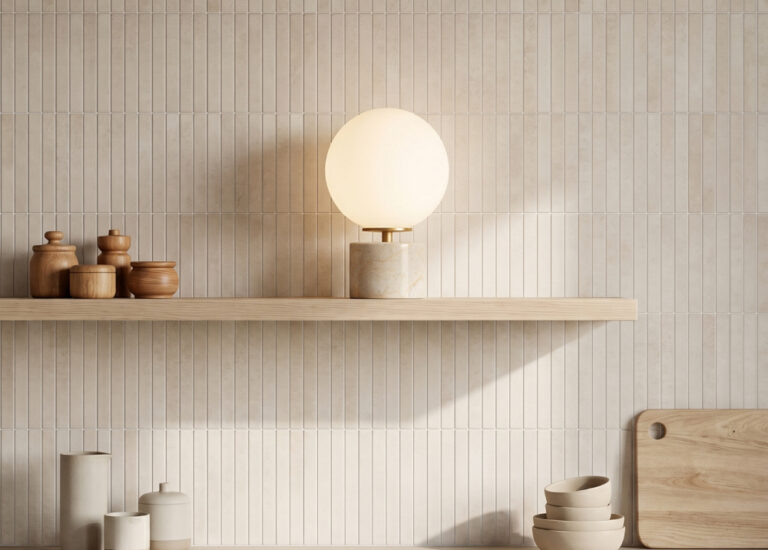
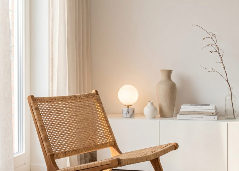
Natural colors stand as a key pillar of interior decoration in 2026. Beige, off-white, chocolate brown, as well as terracotta and earth-inspired palettes, bring warmth and reinforce a feeling of comfort.
Cloud Dancer (Pantone), a soft and airy hue, embodies this pursuit of balance and authenticity, offering the perfect backdrop for deeper tones and noble materials.
To energize palettes without overwhelming them, 2026 trends rely on subtle color accents. Mustard yellow adds a sunny touch, deep red brings character, while sage green and pastels soften the overall look.
Used sparingly, these shades create rhythm and strengthen the identity of each room while preserving harmony.
Discover how light enhances the richness of 2026 decor colors

Adopting 2026 decor colors does not mean repainting everything or completely transforming your interior. The goal is to find the right balance, integrating these shades subtly to create a harmonious, elegant, and lasting atmosphere. Walls, furniture, and lighting work together to shape this visual composition.
Walls are the ideal starting point for introducing trending colors. A wall paint in a deep or natural shade immediately sets the mood of a space.
Accent walls are particularly effective for structuring a room without overwhelming it, especially in living rooms or bedrooms. Soft contrasts between lighter tones and deeper shades add depth while preserving a sense of calm and balance.
Furniture and accessories offer a more progressive and flexible approach. A sofa, rug, or curtains in a trending color can be enough to transform a room.
Decorative objects introduce color accents without long-term commitment. As for lamps, they become true focal points: both functional and decorative, they enhance surrounding colors and fully contribute to the identity of the space.
Light is the key element that reveals 2026 decor colors. Warm or soft lighting smooths deep shades and enhances natural tones.
Highlighting textures — wood, glass, metal, or textiles — enriches colors and creates visual depth. By varying light sources, it becomes possible to create different atmospheres throughout the day, transforming the interior without changing its color palette.

Choosing the right color for your interior in 2026 goes beyond following trends. It is about finding a shade that fits your space, your lifestyle, and the atmosphere you wish to create every day. A well-chosen color transforms the mood of a room and contributes directly to the sense of comfort.
Natural light greatly influences how colors are perceived. A shade may appear soft and luminous in a well-lit room, and deeper or more enveloping in a darker space.
Observing light throughout the day helps refine color choices and avoid overly strong contrasts. A well-designed lighting plan further balances and enhances the selected palette.
Before choosing a color, it is essential to define what you expect from your interior.
Looking for calm and serenity? Soft, natural tones will be ideal.
Seeking character? Deep colors bring structure and personality.
Want warmth? Earthy palettes and enveloping shades create a welcoming atmosphere.
Color then becomes a true emotional tool.
A successful interior reflects who you are. The chosen color should adapt to your daily life, rhythm, and habits.
A relaxation space will not call for the same tones as an area dedicated to work or entertaining. Considering how each room is used ensures a lasting and coherent choice.
In 2026, the focus is on visual coherence. Rather than multiplying colors, it is preferable to build a balanced palette around a few strong shades, complemented by softer tones.
This approach enhances overall harmony and gives the interior a timeless elegance, easy to evolve with accessories or lighting accents.

In 2026, color is no longer considered on its own. It fully reveals itself when paired with the right materials, capable of enhancing its depth and reinforcing the desired atmosphere. Materials become a language in their own right, adding texture, warmth, and elegance to interiors.
Wood, whether natural or darker in tone, remains a timeless choice. It softens deep colors and creates an immediate connection with nature while warming the space.
Textured glass captures and diffuses light, subtly highlighting surrounding tones without freezing them.
Brass and patinated metals bring a touch of sophistication and delicately accent color palettes, especially in interiors inspired by Art Deco or contemporary vintage styles.
Stone and marble offer a strong, timeless mineral presence, ideal for grounding colors within a durable and elegant aesthetic.
👉 These materials enhance color depth and bring lasting elegance, creating balanced, warm interiors designed to stand the test of time.

Colors play an essential role in how we experience a space. In interior design, they directly influence mood, comfort, and the perception of volume. In 2026, their use becomes more conscious, almost emotional.
Cool colors, such as blues and certain greens, promote calm, distance, and serenity. They create soothing atmospheres ideal for relaxation and concentration, making them perfect for rest areas or wellness-focused spaces.
Warm colors, on the other hand, invite conviviality and emotion. Terracotta, browns, deep reds, and yellows warm the space and create a sense of enclosure. They encourage connection and reinforce a feeling of comfort.
Light acts as a true atmosphere revealer. It transforms colors depending on intensity, temperature, and orientation. Soft, well-designed lighting can soften deep tones, enhance natural materials, and allow the ambiance to evolve throughout the day — capturing the spirit of 2026.
In 2026, color goes beyond aesthetics: it becomes a tool for well-being, shaping interiors that are more harmonious, sensitive, and alive.
👉 Add the final touch to your interior with lighting that enhances colors — discover the Alfama Chic collection
Discover our collection of timeless lamps
Kitchen lighting is never just a minor detail. As the heart of your home, your kitchen is where you prepare meals in the morning, enjoy
Slow decorating has emerged as an elegant response to an era saturated with objects and fleeting trends. Far from standardized, disposable interiors, it invites us
In 2026, the bedroom becomes a sanctuary— a space where you can slow down, where light envelops you, and where the materials provide a sense